Making the INHERITANCE cover
Last September, as I was revising Inheritance (the sequel to Adaptation), my editor (Kate Sullivan at Little, Brown) asked if I had any ideas for what I'd want the cover to look like. At first all I thought was, well, it should look related to Adaptation, but it would be nice to convey some sort of progression. Since the girl on the cover of Adaptation was in the water, maybe she should be totally out of the water on Inheritance. (OK, everyone at once: Duh.) Since this was probably pretty obvious, I gave more thought to the book itself. What was it about? What did I want the cover to convey symbolically? (You can read my thoughts on the symbolism of the Adaptation cover here.) While the symbolism might not be directly obvious to the casual viewer, it was still important to me that the image be meaningful.
The title, Inheritance, comes from the same place the title for Adaptation comes from: Charles Darwin's The Origin of Species. For those who want to be tantalized by hinty science, this is what the term inheritance means in biology.
When I thought about inheritance and heredity, I thought about this:

I had no idea how this could be represented in an image of a girl that related to the Adaptation cover, but I started looking through stock image galleries to see if anything popped out at me. This is what I found:
What I liked about this photo was the doubling effect of the reflection, which I felt spoke to the idea of heredity. We mirror back where we come from. And that's when I thought: Hey, maybe we can use a mirror.
I wrote to Kate and suggested using a mirror, but I also noted, "This could be cheesy"! (I think I had a horrible vision of a girl gazing soulfully at herself in the mirror.) Luckily, art director Alison Impey has some sort of gift for interpreting the totally non-graphically-skilled suggestions of authors, because she understood how to make it work.
In November, Kate sent me a cover comp — basically a mockup of what the cover could look like. I'm not going to show it to you now because it looked almost exactly like the finished cover, except with a stock photo of a girl. While the girl didn't look quite right, the image was amazing; it used the mirror idea in exactly the right way.
That was also when I learned that Little, Brown would be doing a photo shoot to get the right girl on the cover. This was a first for me because all of my previous book covers have used stock photos. Clearly you don't need to do a photo shoot to create an awesome cover, but … it's still awesome to have a photo shoot!
After that, I was sent casting images of several possible models who would represent the main character, Reese. She wasn't going to look exactly like the girl on the cover of Adaptation, but a lot of the models were sort of close. Luckily, Alison, Kate and I all liked one girl the best: Ali Gropper. She was hired for the photo shoot, which took place in New York in December. We all agreed she should be dressed in something low-key, without a lot of makeup, because Reese isn't exactly the kind of girl to wear a fluffy ballgown.
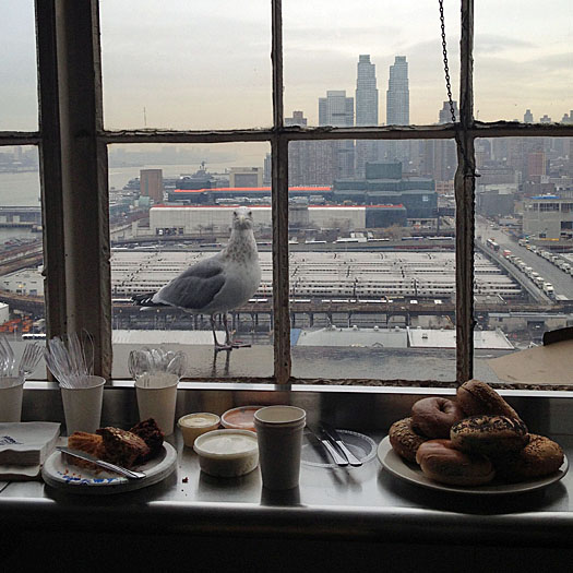
I wasn't there for the shoot, but Kate took several behind-the-scenes photos. As you might remember from Adaptation, the book begins when birds start flying into airplanes, causing them to crash. So, of course some very insistent birds showed up at the studio, providing the proper air of paranoiad doom authenticity.

Meanwhile, inside the studio, everybody was getting set up for the shoot.
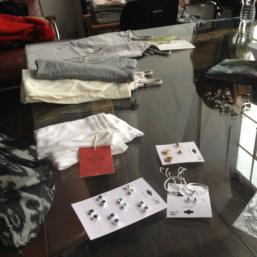
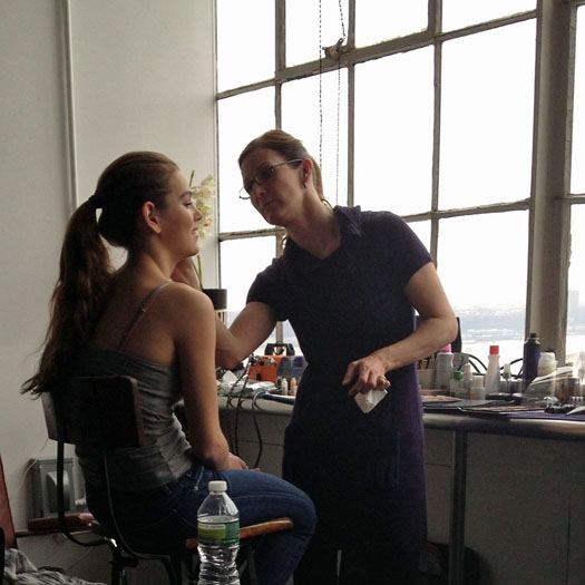
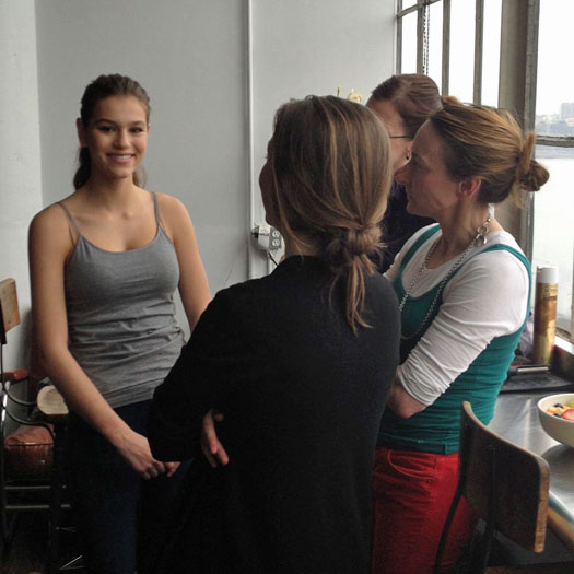
Once everybody was ready, Monica Stevenson took a lot of photos!
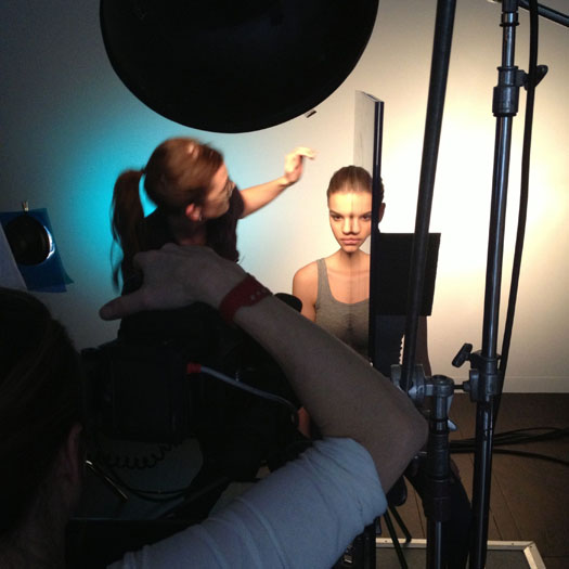

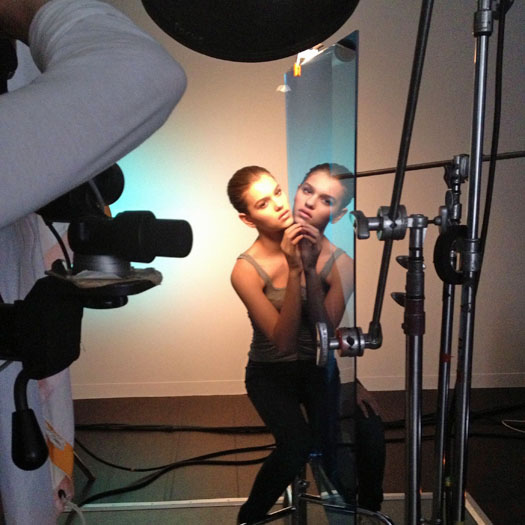
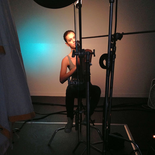
There were a lot of different angles and possibilities to choose from for the cover. Here are some of them:
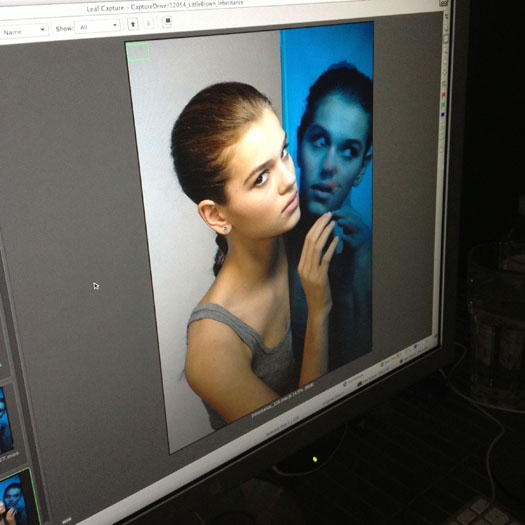
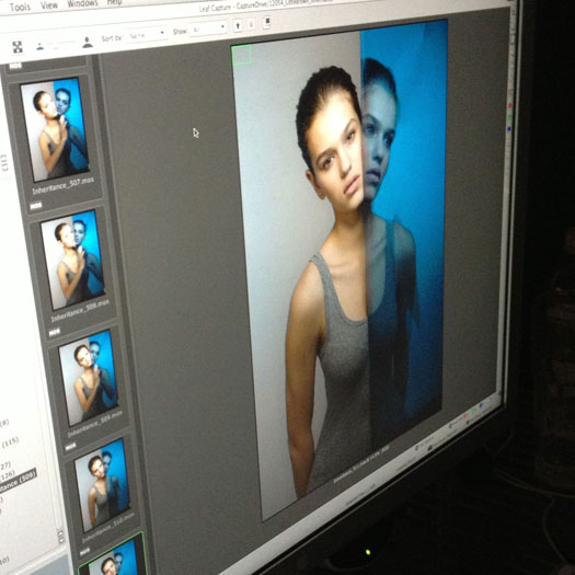
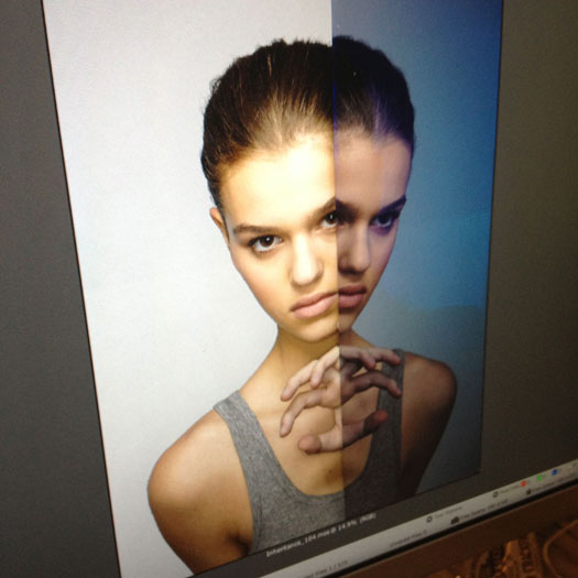
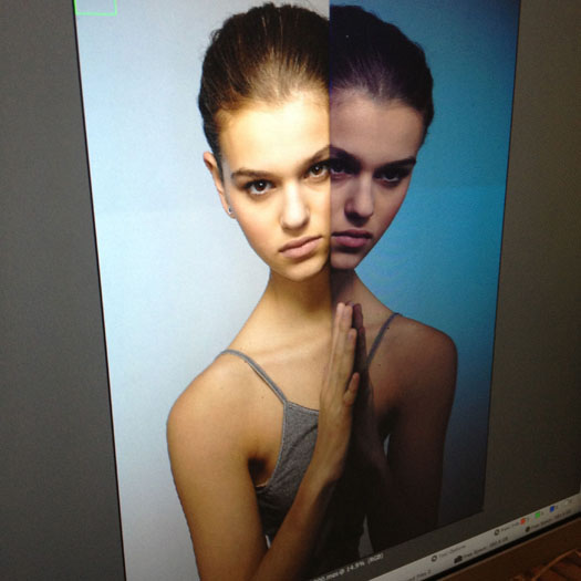
In the end, I really love the photo they chose, and I think it looks amazing next to Adaptation.

I also think that bird wanted to eat some bagels.
What do you think?
Thank you to Kate Sullivan for taking all those photos, to Alison Impey for being such an awesome book designer, to Monica Stevenson for photographing the gorgeous cover, and to Ali Gropper for looking just right!
